THE AXV FILES FINAL REPORT


Please read this disclaimer before reading this report. It is regarding @the.axv.files instagram. 


 MEDIA 1007 Digital Platforms Final Project Report 


CONCEPT AND AUDIENCE:

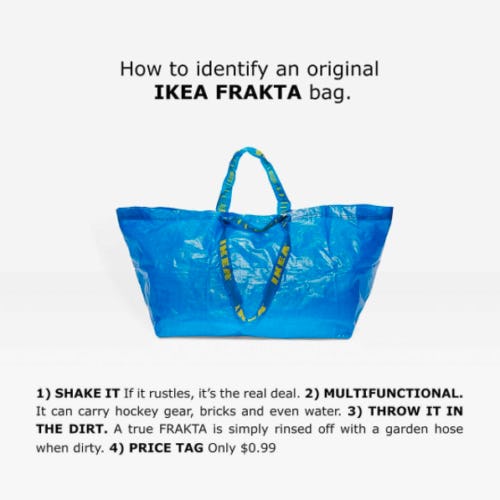
The-AXV-Files is a blog written by AXV.  Through blogs and articles, The-AXV-Files looks at the fashion and creative world through a different lens than a typical amateur fashion blog would, who likely would help readers achieve trends etc. Contrastingly, The-AXV-Files commonly analyses the reasonings behind fashion trends, rather than help readers achieve them. Such as AXV’s Ikea article, similar to this article on ManRepeller. Uniquely, The-AXV-Files’ combines an amateur feel (achieved through AXV’s personal writing tone and the website’s arty and creative design) with content common to professional magazines or media brands like I-D or BoF. Thus, The-AXV-Files is a unique amateur blog, which acts as a creative and expressive platform for the author who discusses fashion through an intellectual, creative and different lens.


QUOTE 1


The target audience is female 18-30-year-olds interested in fashion and from Australia. My wider audience is English speaking individuals part of the ‘fashion/creative community’. My audience is interested in aesthetics and agrees that fashion is intellectual and more than ‘outfits-of-the-day’. Gathered from my statistics on Instagram, my followers are from around the globe, mostly females and are mostly 24-34-year-olds.


VISUAL COMMUNICATION AND DESIGN:

Photography and Design

axv.PNG

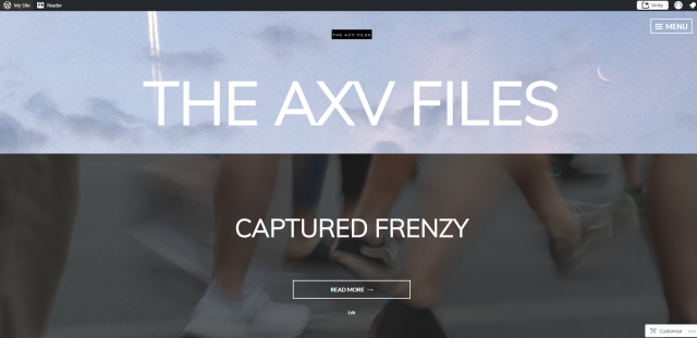
The-AXV-Files connects with its audience by creating an authentic, amateur, raw and creative feel. This is achieved in the site’s background when using the visual design and communication approach of repetition which Tuffe explains and Gesalt’s principle of proximity. Photographs (GiFs) which are grainy and animated are repeated to create an instant impact on viewers, informing them that The-AXV-Files is unique and creative. By using my own footage, I immediately establish a creative, real and genuine feel. Audience members feel that The-AXV-Files is an expressive site, familiarise themselves with AXV’s individuality and understand that The-AXV-Files is an honest reflection of AXVCombined with AXV’s personal writing style, readers connect with AXV.

Prior to the final visual design, the home page looked like this: 

AXVFILES1.PNG

The visual design of this version communicates a less creative, individual and honest feel. This design feels more professional or like a façade, rather than an honest reflection of the author. Additionally, it is noted that in the header I used another grainy sky picture, however, unlike the final design, this sky picture has less impact. This is because the final version repeats the Gif in the background, compared to a single still image used as a header. Evidently, the final design approach is the best for The-AXV-Files because it works towards its values: unique, creative expressive, honest, and raw.

Font and Colour

Font and colour inspired by the background image work together to communicate a strong, clean, hopeful and uplifting feel to readers. The background image – taken in a plane and depicting sun sky and clouds – communicates an uplifting and airy feel. The green colour scheme, and the sharp and modern fonts used in the text and logo, balance the striking background, carry the sense of clarity and create a coherent website. 


USER INTERFACE DESIGN:

Layout

To serve the needs of my audience I have made the layout simple, unambiguous, and relatively consistent (Johnson, 2014). The homepage is an ‘about‘ page, which briefly outlines the concept of the website and has links to social-medias. This helps viewers understand The-AXV-Files and allows them to decide if they would be interested in surfing the site or the social-medias. 

Posts are organised into two categories: blogs and articles to allow readers to decide whether they wish to read short easy posts or longer ones. The about page explains this and links to the blog and article pages. 

Prior to this choice, I organised posts under themes, such as ‘fashion’, so readers can be directed to content they are interested in. However, the website’s menu became overwhelmingly cluttered because posts were repeated under the numerous categories. Creating a drop-down menu would be ideal however the free design; Singl restricted this option, and this categorising option is not necessary as The-AXV-Files only has 9 posts. 

blog articles

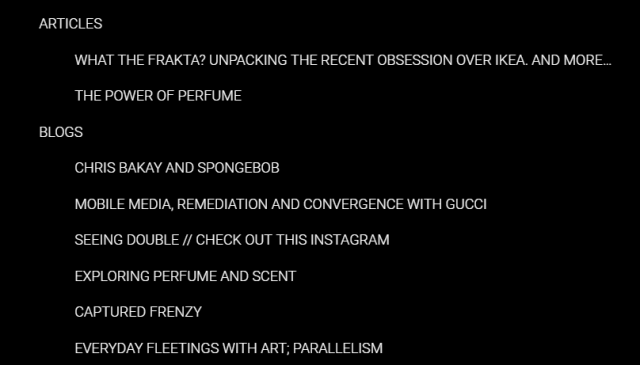
The-AXV-Files’ menu, separating blogs and articles

blogs and articles

explaining and linking to the blog and article pages in the about page

At the beginning of articles ‘contents’ are provided to inform readers what they will be reading, how long the read may be and help readers understand how far they have read the article.  

Interface

The blogs and articles categories are also functioning pages with links to each post in reverse chronological order to ensure readers can access posts in the menu and the pages. 

The-AXV-Files utilises links. In posts links are provided, allowing readers to look at additional information which is referenced or related. Instagram and Twitter posts are also embedded to provide an interactive way of accessing additional information, and to provide my target audience – who as mentioned before are aesthetic driven and Instagram users – with a visual break from writing. Lastly links all open into new tabs to serve the readers experience: ensuring readers do not lose their progress or risk the tab their using to read being stuck in lagging internet. This makes the action of opening tabs easily reversible by closing the tab (Johnson, 2014). 


Structure

This slideshow requires JavaScript.

The slim design of the website affords modularity of my website – meaning it can go from desktop to tablet to phone quite easily.  This keeps the trend that my traffic comes mostly from Instagram into consideration and assists viewers who have accessed my site through my link in my Instagram bio. 

digplatviews

Most of the traffic from phone application Instagram

Thus this particular user interface design is tailor-made for my target audience, who are visual people and active members of the creative/fashion community on Instagram.


USER EXPERIENCE DESIGN ACROSS DIGITAL PLATFORMS:

The-AXV-Files creates a coherent user experience design through social media platforms Instagram and Twitter through various strategies. To create coherency and repetition of my brand and aesthetic,  I use my simple, recognisable and striking logo as my profile image on Twitter and use the green colour scheme used on the website. Thus audience members feel that the author is genuine and the same. My twitter header is also relevant to a recent post and suits the green colour scheme. 

I ensured I kept Instagram posts regular to satisfy the  “aesthetic consumerism” (Sontag, 1977, pg.24), of my audience. Instagram was used as a creative off-spin to The-AXV-Files where I connect with my audience with an artist’s profile with the three registers: professional, personal and intimate. I achieve this artist profile through the following strategies:

1: Posting personal-produced content 

https://instagram.com/p/BjoJiQJlXrd/

2: Sharing intimate thoughts

https://instagram.com/p/BiEn39blJve/

3: Professionally promoting website posts, but with content that might not be used in the website posts but is still relevant

https://instagram.com/p/BibzdQ2h8Ug/

Statistics of each post dedicated to the three register’s of an artist’s profile:

This slideshow requires JavaScript.

By the strategy of reposting someone else’s post, I can get more attention to my Instagram and hopefully more traffic to the website. For example, when following sites I would receive more followers. Another example is when I tagged @chris_bakay when promoting this article and @alma.harel when promoting this article, I received likes and a follow and message.  I also engaged with my Instagram using audience by being an active member of the creative/fashion community by liking, commenting and following others and replying to direct messages and comments on my own profile. 

Unlike Instagram, I use Twitter as an extension of the website: promoting posts with the same content. 

To engage with my 18-30-year-old and aesthetic audience, I embed GiFs into twitter posts – this also maintains the creative feel created by the regular use of GiFs on The-AXV-Files. (example below gained 50 impressions)

I also utilised twitters journalistic affordances to share news relevant to the fashion and creative world.  


AUDIENCE METRICS: 

Instagram Audience Profile

My Instagram successfully captures the audience I intended; those part of the fashion and creative community. This is evident through my followers who consist of fashion brands, retailers, designers and illustrators, artists, art curators, film curators, bloggers, architectural studios, TV/film festivals, magazine contributors/producers/editors, photographers, journalists, brand consultants, models, magazines, makeup artists, music producers, DJ, nonprofit organisations.

Instagram Audience Age 

Always predominantly 25-34, then 18-24

Instagram Audience Gender

My followers are always predominantly female. Although this could be a reflection of Instagram’s statistics with 39% female, and 30% men. (Pew, 2017)

Instagram followers' gender over time

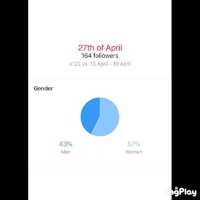
Instagram followers, the percentage of females and males between April 27 – May 27

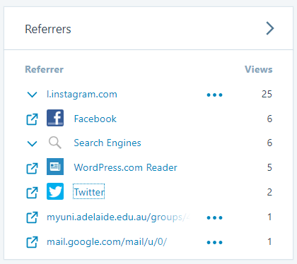
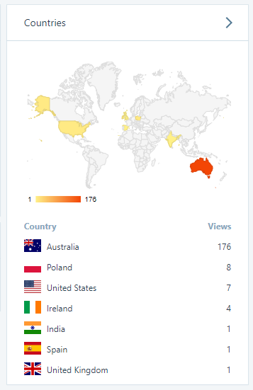
WordPress Audience Locations

Evidently and as I intended, my site and its content welcomes a global audience and does not discriminate audience on location-specific topics. However, despite that the largest quantitative measure for views came from Australia, by almost 200 more views. 

Capture.PNG

Instagram Audience Locations

Unlike my WordPress views, Instagram cultivated a more diverse audience, and the quantitative measures of the number of followers from location fluctuated quite regularly, evident in the two slideshows below. However, despite this, I had a regular following from America, Europe, Australia and Brazil. It is noted that Americans –  20% of Instagram users –  are a consistently above 20% of my followers. 

Countries

This slideshow requires JavaScript.

Cities

This slideshow requires JavaScript.

The fluctuations are due to the type of content I was posting because the types of followers are dependant on the type of content you post. I noticed after hashtagging and posting content about Ikea, the French street brand Vetements designed by Georgian designer Demna Gvasalia, I gained followers from specific locations like Russia who are interested in street fashion and brands like Vetements. However, despite the belief that tagging reaps post impressions, after A/B testing I discovered that my Instagram post with the most likes had no hashtags and was posted on the day I made the account. When I conducted my experiment I posted an image from the same series months later and with hashtags, however, received 152 fewer likes than the first post. 

https://instagram.com/p/Bf4qKE0ldK-/

https://instagram.com/p/BjoJHcIFneX/


FUTURE DIRECTIONS AND DEVELOPMENT:

3 ideas for future direction and development:

Idea 1, Design: Purchase the premium version of WordPress

To solve the ‘drop-down menu’ issue and possibly create themed categories such as ‘fashion’ or ‘art’, in addition to ‘articles’ and ‘blogs’. I will then have the creative freedom to make The-AXV-Files a more honest expression of myself. 

Idea 2, Concept: Open the website to more themes like a magazine and collaborate with others 

Cultivate The-AXV-Files and introduce more themes such as ‘film’ or ‘beauty’ to have alternatives to ‘fashion’ and ‘art’. Possibly collaborate with other writers and creatives to create a robust site. 

Idea 2, Intended Audience: Consider the global audience and tailor content to them

Since I have already captured some views from Asia, America and Europe, I could write content that is better suited to specific global groups. This would require more research and understanding into my global audience and might be useful to consider collaborating with others who understand specific groups. 


WORD COUNT: 1,563


REFERENCES:

Hampton-Smith, S 2017, ‘The designer’s guide to Gestalt Theory’, Creative Bloq, viewed 05/06/18, <https://www.creativebloq.com/graphic-design/gestalt-theory-10134960&gt;

Instagram, 2016, ‘Instagram Today: 500 Million Windows to the World’, Instagram Blog, viewed: 5/06/18, <http://instagram.tumblr.com/post/146255204757/160621-news&gt;

Johnson, J 2014, Designing with the Mind in Mind Simple Guide to Understanding User Interface Design Guidelines, 2nd edition, Boston: Elsevier, pp. 219-222

Kissmetrics Blog, 2018, ‘iOS: A/B Testing, Dealing with the App Store, and Moving Fast’, viewed: 08/06/18, <https://blog.kissmetrics.com/ios-ab-testing/&gt;

Pew Research Centre, 2017, ‘Who uses Facebook, Instagram, LinkedIn and Twitter’, Pew Internet & Technology, viewed: 5/06/18, <http://www.pewinternet.org/chart/who-uses-facebook-instagram-linkedin-and-twitter/&gt;

Sontag, S 1977, On Photography, Picador, New York, pp. 1-160

Schrag, A, 2015, ‘‘Pics, or it didn’t happen’: On Visual Evidence in the Age of Ubiquitous Photography’, Pacific Journal, Vol.10 No.1, pp.1-16

Tuffe, E 1997, ‘Visual Explanations’, pp.79-103

Van Der Nagel, E 2017, ‘From usernames to profiles: the development of pseudonymity in Internet communication, Internet Histories, Vol. 1, No.4, pp.312-331


Mobile Media, Remediation and Convergence with GUCCI

It is no doubt that Gucci has had a VERY serious ‘in vogue’ moment lately. Their recent fashion show in early 2018 created quite the stir. The fashion world when wild after witnessing the wacky world of Gucci’s creative director Alessandro Michele, according to vogue his “imagination was allowed to run riot”

Michele sent out models with third eyes,  models holding “dragon puppies” and iguanas, faun horns poking out from curly hair, and most notably Michele sent Models out effortlessly carrying life-size and incredibly realistic versions of their own heads down the runway, as if they were Gucci bags.

After all this stir I couldn’t help but notice that memes emerging from the show were in fact linked with mobile media, social media, remediation and convergence.

https://www.instagram.com/p/BhaX4FsD0IO/?saved-by=the.axv.files

An image from their show has been remediated with photo editing to look like Facebook and their tagging practice – which is a practice arguably native to Facebook, which has now penetrated to other social media sites like Instagram, and become a ubiquitous practice of the western social media using world. It is interesting to see an Instagram post whose main purpose is to allude to a Facebook practice. It’s also pretty funny because the artist ‘Sid’ is hypothetically confusing Facebook’s face-recognition technology – and face recognition has been another topic of conversation lately. So basically we are converging practices which have been borrowed and remediated elsewhere in this one post, which all happens over social media on mobile media – crazy!

This here is artist Ignasi Monreal painting a portrait of Alessandro Michele onto a real mobile phone as if it were a miniature. This is quite amusing but also full circle like. Monreal paints a Miniature – arguably the first forms of mobile media – onto a mobile – THE pinnacle of mobile mediums for us contemporary folk. The miniatures which we now would consider archaic is painted onto a Mobile. Undoing centries of technological advancement. Undermining and putting an end to the trillions of abilities and modularity of that phone. All of that just to revert a mobile to a miniature. As if our complacency with mobiles has made them so incredibly stale that a miniature is more exciting. Its incredibly ironic and inception like and that’s all I have to say!

https://www.instagram.com/p/Bhi2dTLn2Hj/?saved-by=the.axv.files


Thank you for reading!

AXV


DISCLAIMER REGARDING @THE.AXV.FILES INSTAGRAM, SEPERATE TO THE REPORT


DISCLAIMER SEPERATE TO ASSIGNMENT: 

I have taken advantage of the @the.axv.files instagram profile and transformed it to a personal art account. Since my profile was a business account, was growing an audience, my followers consisted of artists and those interested in art, I had been approached by an artist in direct messenger and the profile was likely to be neglected even though I considered to continue @the.axv.files, I decided to transform it to a personal art account for my art.

I am writing this here as I am unsure whether this report has been marked or when it will be marked and would like to explain why my profile bio, names and image has been changed and I’d like to express that the posts after the ones shown below are for my art account, not @the.axv.files. I have kept the posts from @the.axv.files so that they can still be engage with for the purpose of the report.

Hence: The entire instagram profile, posts, captions and analytics are all true and remain the same. Just the instagram bio, username, name and image has been changed, since completing the entire project and report. And new posts dedicated to my art has been posted and the link to this website in the instagram bio has been removed. 

I Hope I have explained this well and that this does not effect my report or the perceptions about the development of @the.axv.files. I also understand that transforming @the.axv.files into a personal art account was not discussed in the final paragraph of my report, that is because when writing the report I genuinely was unsure about using the instagram (not the twitter or the website) as my art account. And I felt that the transformation to a personal art account was very seperate to the assignment and the developments of @the.axv.files.

Apologies if this has caused any inconvenience. Thank you for reading this and hope you understand my decisions to alter my own instagram profile which I worked on for my own reasons as an artist. Thanks again!

THE AXV FILES INSTAGRAM BEFORE IT WAS TRANSFORMED TO AN ART ACCOUNT: 

Screen Shot 2018-06-17 at 1.23.12 pmScreen Shot 2018-06-17 at 1.23.22 pm

Chris Bakay and SpongeBob

I thought I was the only one who when I saw Chris Bakay’s art and immediately thought of THAT ‘sweater of tears’ SpongeBob episode, (which after some googling I discovered was actually the ‘Dying for Pie’ episode (but whatever it will always be the sweater of tears episode)) Anyway turns out there are memes out there which also connected the dots between Bakay and SpongeBob. And as an art and SpongeBob lover, I am loving this.

all+shirts+1500+x+1500+-+straight+on+wide+clr.jpg

Although transparent, there is more to Bakay’s work that meets the eye. His simple yet striking T-Shirts are from his Retired Jerseys series.

Read his Retired Jerseys statement below


How is it everyday objects can express empathy and evoke shared memories of past experiences? By charging an object with meaning we change its purpose and value. Maybe the highest calling an object can have is for it to move past its use value and become something more. Through their connection to a time, place, and or person, objects become resonant conveyors of meaning. Once imbued with meaning, they can speak, act and heal.

I lost my older brother, David, in a car accident in 1996. He was only 20 years old and since it was 1996, there weren’t a lot of pictures or video of him. I cherish the few I have but I noticed his objects held a much deeper power over me. People connect with the story of my brother as well as their own memories stored in each of the objects represented in these works. Whether recalling their own meanings within these objects or connecting with the story of my brother, nostalgia becomes a balm for the everyday.

Like most younger siblings, I thought my brother was a legend. By elevating the physicality of both his objects and ones of that time period, I am presenting a somewhat biased portrait of his life and athletic prowess. This is where the series title, “Retired Jerseys” came from.

The works are hanging sculptures made from cast UV-stable epoxy resin. Some are clear or tinted while others are vintage shirt designs re-imagined as clear or translucent versions of their original selves. Simply put, clear is a metaphor for the intangibility of memory. Some are accentuated with objects from the time period they represent. These include vintage fake Oakley sunglasses, a vintage Drakkar Noir cologne sample, vintage yellow Sony Sports headphones and a vintage pager to name a few.


Check out Chris Bakay’s insta here

Watch an insider video on him here


Thanks for reading

AXV

What the Frakta? Unpacking the recent obsession over Ikea. And more…

How the fashion world, Ikea, our changing society and McDonalds are all interrelated…
if you are interested in this, check out this related podcast and this impending live-stream

Article contents:
IKEA AND THE FASHION WORLD
THE RIPPLE EFFECT OF THE IKEA BAG
IKEA AS A SUBGROUP IDENTIFIER?
STREET MEETS LUXURY: IKEA IS NOT THE ONLY BRAND ‘VICTIM’ TO RE-BRANDING

IKEA AND THE FASHION WORLD:

If you simply google ‘Ikea and fashion’ you stumble across endless articles proving those two words are actually synonymous. 

This is the case because Balenciaga released it’s ‘carry shopper’ an almost identical iteration of Ikea’s ‘FRAKTA’ in April 2017. Thus the fashion world when nuts! After this phenomenon and the recent passing of Ingvar Kamprad (Ikea’s founder), all things Ikea saturated media platforms.

An Ikea spokesperson says that they “are deeply flattered that the Balenciaga tote bag resembles the Ikea iconic sustainable blue bag for 99 cents,” and that “nothing beats the versatility of a great big blue bag!”

IKEA’S TONGUE IN CHEEK RESPONSE:

Imitation is the highest form of flattery, and Ikea ensured customers could differentiate the real vs the imitation.

After the ‘incident’ Johan Holmgren told AdFreak that he “wanted to act fast, so [he] called Morten Kjaer from Ikea Creative Hub. He loved the idea.” They came up with this:

25564-1-500x500

The ad – which is in Ikea’s iconic aesthetic and shows the bag in a Balenciaga way – is titled ‘How to identify an original IKEA FRAKTA bag.’

4 steps help customers differentiate the real bag from the fake:

  1. 1) SHAKE IT
  2. 2) MULTIFUNCTIONAL
  3. 3) THROW IT IN THE DIRT.
  4. 4) PRICE TAG

What makes this ad absolutely perfect is that Ikea antagonises Balenciaga as a ‘bootleg/counterfeit’ brand. Counterfeit brands for luxury brands, like Balenciega, are a common pest who make money from cheaper copies of ‘luxury designs’ and make their products a readily available and arguably bastardised.

Steps 3 and 4 truly poke fun at the $2,850 AUD Balenciaga bag. Ikea notes that “a true FRAKTA” can be thrown in the dirt and hosed down with a price tag of “only $0.99” (obviously unlike the Italian made leather Balenciaga bag).

This ironic, inception like humour on Ikea’s behalf is simply amazing. No wonder Ikea is everyone’s favourite.

Ikea continued to capitalise on the social media hype:

And then Ikea FURTHER capitalised on this by announcing Virgil Abloh (founder of brand OFF-WHITE which has a huge cult following) will be prototyping the FRAKTA bag:

THE RIPPLE EFFECT OF THE IKEA BAG:

Fashion social media communities blew up with peoples’ own clothing iterations of the FRAKTA bag. An Instagram named studiohagel said in a caption of an Instagram post that “Balenciaga will be like: “What the FRAKTA?!” And yes we agree, the many and messy layers of imitation between franchise, luxury brand and users of Instagram does require both a question and exclamation mark.

HAVE A (very long) SCROLL TO SEE SOME OF THE MANY ITERATIONS OF THE FRAKTA BAG:

https://www.instagram.com/p/BTjeNo8Fn9r/?utm_source=ig_embedhttps://www.instagram.com/p/BGVS8bHBbWB/?taken-by=ililtokyohttps://www.instagram.com/p/BTlTZ2ABpwb/?utm_source=ig_embedhttps://www.instagram.com/p/BgnFOkJDKSI/?taken-by=omweekendhttps://www.instagram.com/p/BJr32Tfg6l9/?taken-by=studioalchhttps://www.instagram.com/p/BTyomyDA0PT/?taken-by=zhijunwanghttps://www.instagram.com/p/BPtGyBEh9Z2/?taken-by=ililtokyohttps://www.instagram.com/p/BepAANwjhnr/?taken-by=omweekendhttps://www.instagram.com/p/BTob4gMgaRs/?taken-by=signeralkovhttps://www.instagram.com/p/BT5PZr9AVQT/?taken-by=vandythepinkhttps://www.instagram.com/p/BTynPk5Amni/?utm_source=ig_embedhttps://www.instagram.com/p/BTu6MdkAf-O/?taken-by=vandythepinkhttps://www.instagram.com/p/BT4TvdXDcQ4/?taken-by=ainysstylehttps://www.instagram.com/p/BT3dvH7gtZ5/?utm_source=ig_embed&utm_campaign=embed_ufi_controlhttps://www.instagram.com/p/BgSU0IlD-0g/?taken-by=omweekendhttps://www.instagram.com/p/BT08c-4g7aF/?utm_source=ig_embedhttps://www.instagram.com/p/BfQ7SK1Hwyi/?taken-by=studiohagelhttps://twitter.com/ALLKIX/status/862311173571706880

https://www.instagram.com/p/BgnFOkJDKSI/?taken-by=omweekend

https://www.instagram.com/p/BPtGyBEh9Z2/?taken-by=ililtokyo

https://www.instagram.com/p/BepAANwjhnr/?taken-by=omweekend

https://www.instagram.com/p/BT5PZr9AVQT/?taken-by=vandythepink

https://www.instagram.com/p/BTob4gMgaRs/?taken-by=signeralkov

https://www.instagram.com/p/BTu6MdkAf-O/?taken-by=vandythepink

https://www.instagram.com/p/BT4TvdXDcQ4/?taken-by=ainysstyle

https://www.instagram.com/p/BgSU0IlD-0g/?taken-by=omweekend

IKEA AS A SUB-GROUP IDENTIFIER?

Evidently, Ikea almost became a tailor-made suit and Vespa for the mods, a motorbike and leather jacket for the rockers or a shaven head and Dr Martens for the Skinheads.

Ikea arguably became a form of identification to a massive and undefined sub-group which spans across the globe – just like the franchise itself does. Ikea’s relatable nature and it’s iconic and changeless blue and yellow logo is what makes the brand so very susceptible to being iterated.

ikea150__v-gseapremiumxl.jpg

Ikea’s reasonable prices arguably makes the brand a socio-economic identifier. This sweeping Ikea phenomenon celebrated the fact you were an Ikea customer. Someone with an average income who might be filling their small apartments with their flatpacks. Hence ‘Instagramers’ witnessed many youths and young adults who identified with the brand wearing their own DIY appropriations of the Ikea 99-cent bag. This is contrary to the ‘cut tags’ on Levi’s jeans which defaced their iconic red tag on the back of a jean. The sliced tag acted as a sign which translated that the pair of jeans were a discount pair. Wearers – mostly people with lower social or economic class – felt branded wearing their cut-tag on display. In Ikea’s case, the ‘cutting’ of the 99cent product only propagated the brand’s icon.

But this argument that Ikea is a sub-group identifier, could actually be all untrue. It is counter-argued that social behaviour has notably changed since the last century where commitment was the common:

BoF expresses in their article titled ‘In The Aesthetic Blender‘ that “we now live in a ‘Supermarket of Style’ where young people cut-and-paste stylistic identity at will” unlike once where we were required “to make strong commitments to semiotic tribes.”

When we consider the qualities of today’s rapidly paced world we can understand how our behaviours and attitudes towards fashion and commitment have also shifted. Qualities include:

  • Shorter attention spans
  • The expectation of instant gratification
  • The attitude that everything is disposable and ‘single use’
  • The rise of high saturation in short amount of times
    • ‘Viral’
    • ‘Trending’

Jumping onto trends: The want to belong and behaviour to conform, has always existed, however, has perpetrated with our changing behaviours and attitudes. Social media platforms like ‘Instagram’, are epicentres which confront global audiences with images which pressure us to ‘belong’ or conform to certain ideals of beauty, fame, success or fortune. Thus, it can be argued that the Ikea phenomenon was not a committed, genuine and deep-rooted sense of belonging, but rather an ‘I’ll jump on this band-wagon too, because I’m seeing everyone on Instagram jumping on’ type of belonging.

According to Megan Gutashaw “when the fashion world shines its light on a mass-market brand, they typically eat it up.”

The short-lived Ikea phenomena became so extremely viral because of social media, because it was a trend and the 99-cent bag was an easy and affordable item to DIY which gave users an instant sense of belonging to the global and viral trend.

STREET MEETS LUXURY: IKEA IS NOT THE ONLY BRAND ‘VICTIM’ TO REBRANDING

As Gutashaw touched on, Ikea is not the only mass-market brand subject to being used in fashion.

Jeremy Scott’s debut runway collection for Moschino as creative director in 2014 paid homage to an American 80s and 90s through American iconography, including:

  • Barbie
  • Cheetos
  • Froot Loops
  • Hershey’s
  • Run-DMC
  • SpongeBob SquarePants

However, Scott’s use of McDonald’s is what went almost as viral as the Ikea Phenomenon.

The juxtaposition of ‘luxury brand’ with ‘mass-market brand’ is what makes this phenomenon so desirable, unique and interesting. This intersection allows wearers to be a part of the lay-person community and the luxurious (or maybe now the Intsa-celebrity) community simultaneously. Tim Blanks, a BoF editor-at-large writes that “the relationship between high culture and low culture” can be tracked back, however “has been much more defined over the last decade.” Evidently, in today’s highly saturated world, we sure do want it all; to belong everywhere. Anya Hindmarch says that “there’s something funny about something ‘every day’…[seen] through a twisted fashion optic.” Hindmarch has also adopted mass-market logos including Kellogg’s. Like Ikea monopolised on the exposure and the Ikea brand received a renewed breath of life and popularity after the Balenciaga bag, Hindmarch says that brands are “thrilled at the awareness” as it puts their brands “in a different and highly visible market.”

BoF writes regarding the Ikea and Balenciaga bag situation that: “According to Tribe Dynamics, the bag resulted in $2.3 million in earned media value from January to September this year. Thank to coverage from The Daily Mail, The Guardian and Time, it also reached a much wider audience — 116 million — than from traditional fashion media.”

Getting one’s hands on anything blazoned with ‘Ikea’ immediately makes them feel a part of this niche community which juxtaposes reality and luxury, and French ‘luxury street-reality’ brand Vetements practices that juxtaposition. Creative director of Vetements, Demna Gvasalia sells boots which have been carefully crafted from Italian soft grainy leather and made to look scuffed, dirty and very ‘streetwear’ for a very luxurious price of $2,300 AUD. The boot is also held up by a Stabilo inspired blue ‘highlighter’ as a heel, again adding a street element to the shoe. Gucci and Balenciaga have done the same, debuting ‘dirty’ street shoes onto the runaway.

00-lede-gucci-sneakers.jpg

Gucci

03-embed-sneakers.jpg

Balenciaga

01-sneaker

Grafitti shoe: Vetements X Reebok


Owner of ‘concept store’ Machine-A Stavros Karelis, says that “Designers want to reach a completely different audience and demographic that has little to do with luxury fashion.”

Thus, it can be contested whether consumers are remotely drawn to the ‘luxury’ element of these street-luxury brands and products. Either way, the ‘street’ element undeniably makes products of luxury more relatable and attainable to consumers, who most likely have wished to be a part of the ‘luxury’ community beforehand. Again, the Ikea bag is a great example of a product which brings together and blurs ‘street’ and ‘luxury’.

original

An almost parallel comparison to Balenciaga’s viral Ikea bag (which Vetements’ Gvasalia was behind), is Vetements; DHL t-shirt which became viral late 2015. The ubiquitous shipping brand DHL quickly became an icon associated with luxury and was coveted by many on Instagram.

Tim Blanks says that the appropriation of mass-market brands has “not been an ongoing trend in fashion, but it has been in art, and art and fashion are much more intermingled now.” Blanks clearly expresses that Warhol’s revolutionary 1962 ‘Campbell Soup Cans’ ushered in logomania. However, “today’s fashion creatives are much more complicit” compared to Warhol who commented on the post-war consumerist society.

BoF neatly and humorously writes: “Indeed, though certainly less subversive than their predecessors, today’s virile renditions of logos and populist iconography are often calculated to resonate with a generation of logomaniacs and internet meme-lovers. Though in the case of some, it can also provide some food for thought, be that a Big Mac or something more substantial.”


Thank you for reading!

AXV

seeing double // check out this instagram

You will never know you needed this until now…

@Tabloidarthistory  with 21.4K followers prove there is proof in their simple and effective insta-pudding recipe. They juxtapose ‘IRL’ moments to art moments.

There is something addictive about their posts: Contemporary culture, the latest entertainment news, memes, throwbacks and more will be compared to Picasso’s, Monet’s and more!

Because according to them, “for every pic of Lindsay Lohan falling, there’s a Bernini sculpture begging to be referenced.”

It is a fun twist on the stuff we see floating around on Insta – and also makes us question the value of art and photos – (as I’ve discussed earlier here)

Check out their posts below…


EXPLORING PERFUME AND SCENT


In the light of THE POWER OF PERFUME I invite you to explore people’s takes of perfume, to experience scent through a sense of sight and sound.


chanel.PNG

EXPLORE THE STORY BEHIND CHANEL’S CLASSIC N°5

http://inside.chanel.com/en/no5 


Capture.PNG
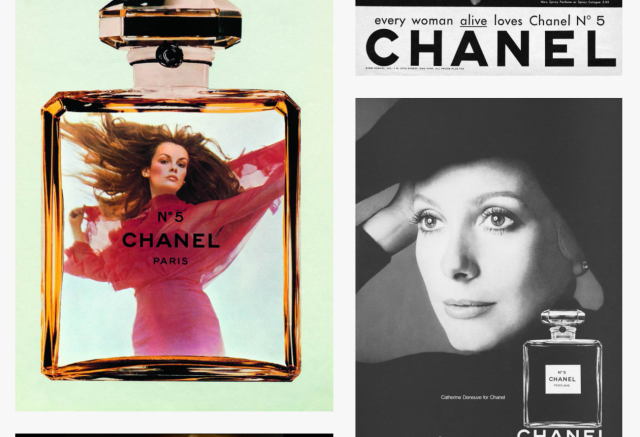
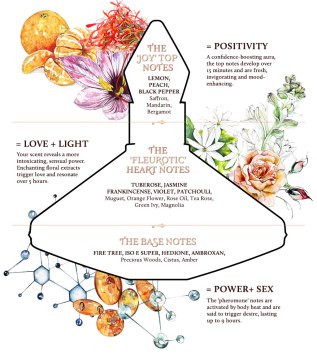
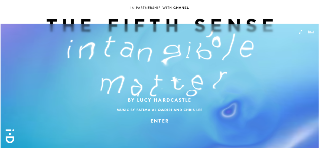
EXPERIENCE CHANEL’S ‘N°5 L’EAU‘ WITH ALMOST EVERY SENSE BUT YOUR SENSE OF SCENT WITH
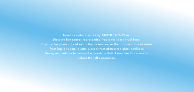
 LUCY HARDCASTLE‘S ‘INTANGIBLE MATTER – IN PARTNERSHIP WITH CHANEL AND I-D MAG‘S ‘THE FIFTH SENSE‘ SERIES

Captureeee.PNG

ALSO SEE AN EPISODE WITH LUCY HARDCASTLE BY I-D MAG:


C60vMJvV0AA6H6y.jpgWATCH ALMA HAR’EL‘S SHORT FILM ‘JELLY WOLF‘ IN PARTNERSHIP WITH CHANEL AND I-D MAG’S ‘THE FIFTH SENSE‘ SERIES

check out the electric and romantic aesthetic in these BTS photos:


sdfghjk.jpg
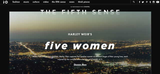
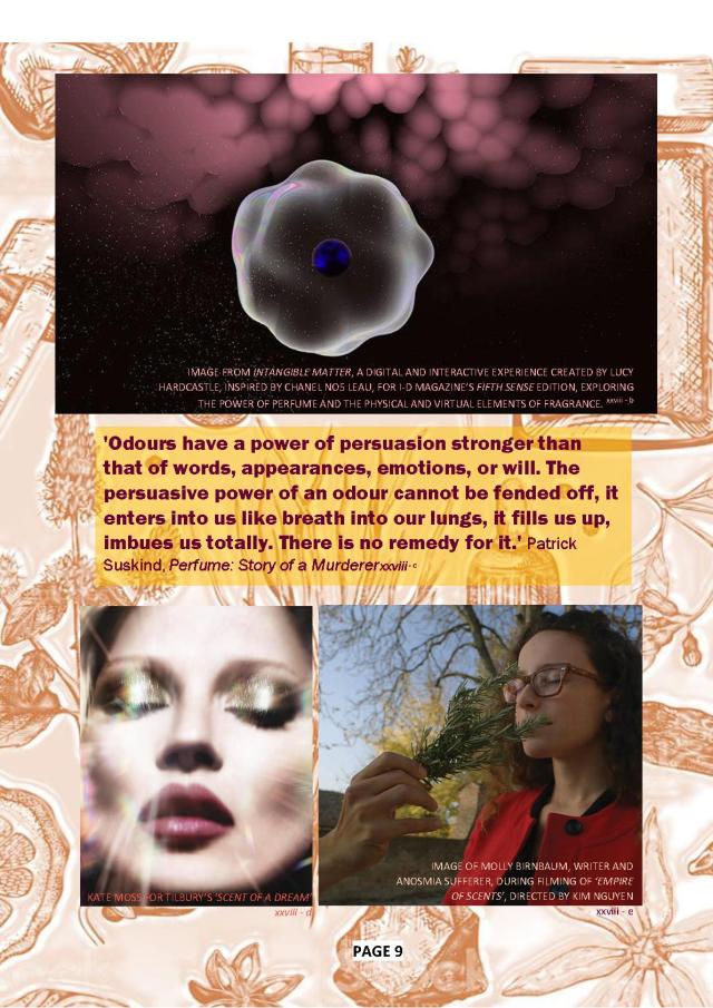
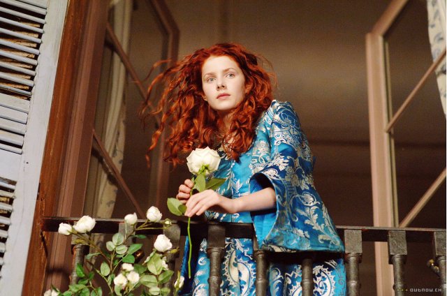
WATCH THE TRAILER TO TOM TYKWER’S ‘PERFUME: THE STORY OF A MURDERER‘ BASED ON THE NOVEL ‘PERFUME‘ BY PATRICK SÜSKIND


FEATURE_Review_CharlotteTilbury_ScentofaDream.jpg

CHECK OUT CHARLOTTE TILBURY’S ‘SCENT OF A DREAM‘ WHICH CLAIMS TO ENHANCE CONFIDENCE AND ATTRACT OTHERS

CTB16-09-SOAD_The-Notes-Of-The-Scent_Diagram.jpg

http://www.charlottetilbury.com/uk/scent-of-a-dream-perfume


b055b20e01a3f38df420d9c34649262b.jpg

EXPLORE KIM NGUYEN’S ‘EMPIRE OF SCENTS‘ WHICH INCLUDES A SHORT FILM, SHORT DOCOS AND ‘AN EXPERIENCE’

http://experience.nezlefilm.com/


2HlBvngS9qtH0WVNAn7V_83fbaf7f-59c8-4331-8a35-8ce053f26ae7.png

WATCH MARK BORTHWICKS SHORT FILM FOR MAISON MARTIN MARGIELA’S 2ND perfume, ‘(Untitled) L’Eau’

https://www.nowness.com/story/margielas-heavenly-scent

97c58f304d6b5ec519addfed542d91e2.jpg

WATCH DAPHNE GUINESS’ SHORT FILM ‘MNEMOSYNE’ FOR COMME DES GARCONS  PERFUME ‘DAPHNE

https://www.nowness.com/story/scent-and-sensibility


dbnv.PNG

FOR MORE FILMS AND EXPERIENCES

https://thefifthsense.i-d.co/en_gb/ 


Thanks for reading

AXV

Everyday fleetings with art; Parallelism

CAPTURING IMAGES  

When rushing to uni or when out with friends it’s easy to miss miniature moments worth capturing on camera. (but whats worth capturing? That’s up to you the photographer – according to Berger)

I personally am super excited by shapes, lines and colours or moments of honesty or irony etc. So basically I am attracted to anything I see, (which does get tiresome as I am always snapping pictures)

Catching images which are so-called ‘aesthetically pleasing’ in your everyday life is really a matter of training your eye to be aware of its surroundings, until it acts like a camera on the prowl, putting things into a frame in your imagination. For some, it is second nature to ‘see’ these moments and others it’s a practice, either way, we all see differently and all consider different things beautiful!

~

Below are six images I captured in my everyday life; walking home with groceries in hand, eating dinner out, visiting Sydney’s MCA, driving to see family, walking home from uni and leaving the Queen Victoria building. 


~


SO WHY WAS ONE OF THOSE IMAGES ‘WORTH’ CAPTURING?

AVA V PARALLELISM 1.1

My eye immediately was drawn to the graffitied ‘Ikea’, then I immediately drew on information I had seen in the media: the recent passing of Ingvar Kamprad Ikea’s founder and how Ikea has been ‘in fashion’, (both literally and figuratively). Thus I decided to frantically pull out my phone so I could quickly take the picture as I crossed the street. I liked the way I framed the image so that ‘Ikea’ is the focal point and sits in a third of the frame: almost like this image is a homage to Ikea and Kamprad. I also liked the idea that Ikea being blazoned on the exterior of a car park in Australia conveys the breadth of Ikea. I felt this was an architecturally interesting image. I was attracted to the pattern density (created by the architecture of the two different buildings) juxtaposed against the very perfect blue sky. I was also attracted to the almost monotonal palette of the image: grey and blue tones. Lastly, I liked the mixture of both soft and sharp architectural elements.

AXV4IKEA

image edited on Adobe Photoshop into Ikea’s iconic colours

see the post which this image inspired

ikea150__v-gseapremiumxl


PARALLELISM 

After reading about Parallelism in Edward Tuffe’s ‘Visual Explanations‘ (1997), I learnt that parallelism is “the matching of phrase against phrase, clause against clause” according to Richard Altick. Basically, in basic terms its when images have striking similarities when the multiple images draw parallels – mostly in their aesthetic and structure.

THREE.jpg

I chose these three images for their similar linear/geometric shapes. The similarity is highlighted by the white lines overlayed on the original images. The repetition is striking and as Tuffe conveyed the repetition actually creates clarity, thus making the similar structure very notable to the viewer.


Also –  if you are into parallelism on Insta, go follow French designer Jacquemus.


Thanks for reading.

AXV